You take home the perfect chip. It felt right in the store. Not too beige, not too gray. But then you paint a wall, and nope. It’s not what you imagined. Not even close. And honestly, it’s frustrating—like, how does this happen? But the thing is, swatches are just a starting point. They’re printed. Flat. Lifeless. They can’t show you how light moves through a room or how it bounces off your furniture or sinks into the shadows behind your couch.
And walls? They’re full of angles and odd lighting quirks. Afternoon light in the corner of your living room isn’t going to treat that color the same way as the overhead fluorescents at the store. That’s why the best thing—though it feels like an extra step—is always testing paint on the actual wall. It’s not overkill. It’s just reality.
Light Changes Everything
Lighting is probably the biggest reason for color changes. And it happens fast—like, you tilt your head and it already looks different. Store lighting is harsh and cold and weirdly yellow, depending on where you shop. But at home, you’ve got sunlight during the day, warm lamps in the evening, and maybe even a few overhead LEDs throwing things off.
- Colors cool down under natural light.
- They warm up under soft white bulbs
- They go kind of dull under fluorescent light
Also, room direction matters. A north-facing bedroom? Expect it to pull cool. West-facing living room? Get ready for golden tones at 4 p.m. It’s not subtle, either. That dreamy greige you loved might look straight-up lavender once you paint it and the sun hits from the side. So yeah, test it where you live, not where you buy.
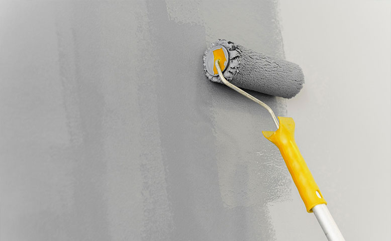
The Finish Plays a Role
Here’s something people forget: the finish changes everything. Gloss, satin, eggshell—these aren’t just words on a can. They each bounce light differently. A high-gloss paint might look crisp and bright on a sample but feel almost shiny or harsh once it’s on a big wall. Meanwhile, matte finishes tend to absorb light, which can make the same color seem deeper or quieter.
A soft off-white in satin can look nearly reflective, while in flat, it fades into the background. That’s not bad or good—it just is. It’s worth grabbing a sample of the finish you’re actually planning to use. Swatches don’t come with that kind of clarity. They just give you a teaser. But the finish is where things really settle—or don’t.
Wall Texture Makes a Difference
Walls are never as smooth as we think they are—even new ones. There’s always some kind of texture happening—drywall seams, roller strokes from past paint jobs, light knocks, and dents. And when you apply new paint, that surface catches the light in a hundred weird ways. You’ll get shadows where you didn’t expect them. The color gets darker, sometimes richer, sometimes just muddier.
A swatch, on the other hand, is dead flat—zero texture. So naturally, it doesn’t prepare you for how that color will stretch, scatter, or settle when it hits a real wall. If your surface is bumpy or has even a light orange peel texture, just know the color won’t sit still. It shifts slightly, and honestly? That shift can be kind of beautiful, or annoying. Depends on the color.
Surrounding Colors Shift Perception
Colors don’t live in isolation. That’s the thing. Your walls are constantly reacting to what’s around them. Dark wood floors, bright white trim, beige furniture—it all reflects light onto the walls and tweaks the color just enough to throw you. That soft taupe you chose? It might feel pink if your flooring leans red. Or too green next to yellow-toned lighting.
The room becomes a mirror of all its parts. You can’t really predict it from a tiny chip. Testing paint in the room, against your actual stuff, lets you see how it interacts with your space, not just your imagination. Sometimes the issue isn’t the paint—it’s everything else.
Paint Application Can Affect Appearance
Here’s a messy truth: the way you apply paint changes how it looks. Pressure matters. The type of roller matters. Even if your wall is dry. If your coverage is uneven—even a little—you’ll end up with light and dark patches that don’t go away just because the paint dried.
Primer? It helps—a lot. If you skip it or use the wrong kind, the final color can feel off, like it’s missing depth or punch. It’s not about being a perfectionist; it’s about knowing that paint isn’t magic. It’s layered, affected by what came before. Smooth, steady coats go a long way toward making the color feel honest.
Daylight vs. Nightlight Drama
This one’s real, and people forget it constantly. A paint color can look one way during the day and completely different at night. Sometimes shockingly so. That greige you loved all afternoon? It might read green once the sun sets and your warm bulbs kick on.
If you only look at a color once—at one time of day—you’re setting yourself up for a surprise. It’s worth checking in a few times. Day, evening, even when the weather shifts. Because rooms are alive, they change as the light changes. And you want a color that works in all of those moods, not just when the lighting’s perfect.
The Human Brain Fills in the Gaps
Your brain is doing the most behind the scenes. It’s constantly adjusting what you see to make things make sense. And sometimes that backfires. One person sees soft beige, another sees greenish-gray. Both are right. Kind of. Context, memory, and comparison all play into how you read color.
Also, colors influence each other. If you’ve got one strong color in the room, it’ll skew how the other ones appear. And once you notice it, you can’t unsee it. This isn’t a problem to fix—it’s just good to know. You’re not going crazy. Your perception is just doing its thing.
Conclusion
Paint doesn’t lie—it just responds. To light, to texture, to surroundings, to time of day. And swatches? They’re like book covers. You don’t know the full story until you open it up and live with it for a bit. So yeah, take your time. Tape up samples. Paint a patch. See it in the morning and at midnight because that’s how color really introduces itself.
Companies like Garcia’s Painting get that. We don’t rush the process—and neither should you. The best results come when you let your space speak, not when you rush to fill it with a color that only looked right under store lights.